Sterling Renovations
- Logo Design
- Branding
- Print
- Digital Design
Foundation of a
strong identity

The Brief
- Create a clean, modern logo and brand identity that reflects craftsmanship
- Design print collateral including business cards, flyers, and van signage
- Develop a professional look for uniforms to strengthen team presence
- Establish a cohesive and recognisable presence in the local area
The Process
- Getting to know the business, services, and audience to build a relevant and trustworthy brand
- Exploring styles, colours, and typography that conveyed professionalism and precision
- Crafting a clean, geometric word mark that would be instantly recognisable across print and digital
The Solution
We created a bold and refined brand identity that mirrors Sterling Renovations' craftsmanship and professionalism. The new branding is simple yet striking, designed to communicate reliability, skill, and attention to detail- values that underpin every project the team delivers.
At the heart of the identity is a clean, geometric icon that balances modernity with a nod to traditional building values. The bold typography reflects strength and stability, while the refined colour palette keeps things polished and professional across all touch-points.
- Logo: A strong, structured identity that reflects the team's precision and pride in their craft
- Colour Palette: Oxford Blue and Sky Blue paired with Steel Grey, drawing inspiration from their Oxfordshire roots
- Branded Collateral: Flyers, business cards, workwear, and vehicle graphics designed to make an impression on-site and on the move
- Print-Ready Artwork: Clean, production-ready designs optimised for real- world use to enhance marketing materials
The pixel-
powered impact
Professional & Polished
The refined branding reflects Sterling's craftsmanship and reliability, making a strong first impression with clients and partners alike.
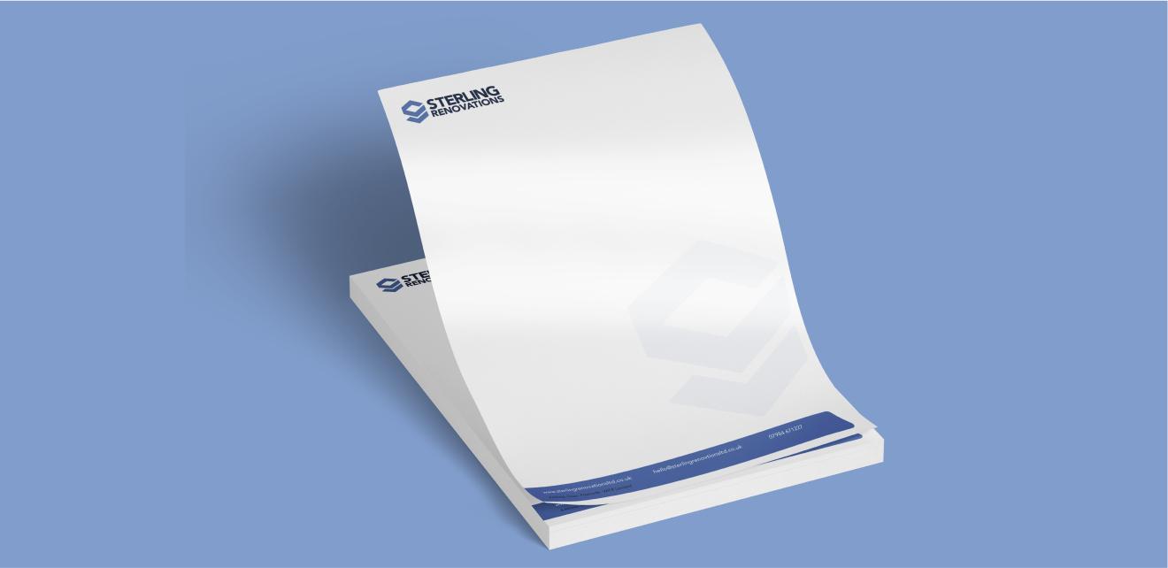
Cohesive Visual Presence
From uniforms to business cards and van signage, the branding creates a unified and recognisable presence that reinforces credibility.
Stronger Local Recognition
The Oxford Blue and Sky Blue palette pays homage to the company's Witney roots, helping the brand feel authentic, established, and community-connected.
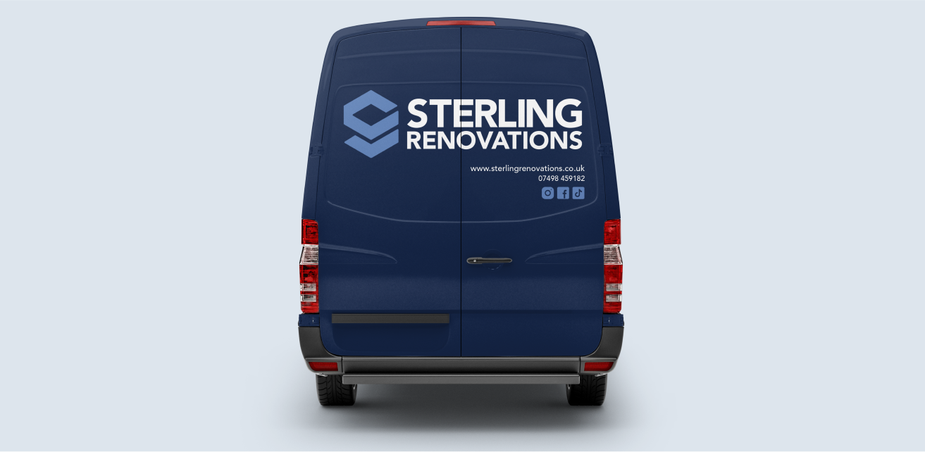
Increased Visibility
Branded vehicle graphics serve as mobile advertising, helping Sterling Renovations get noticed and remembered across the local area.
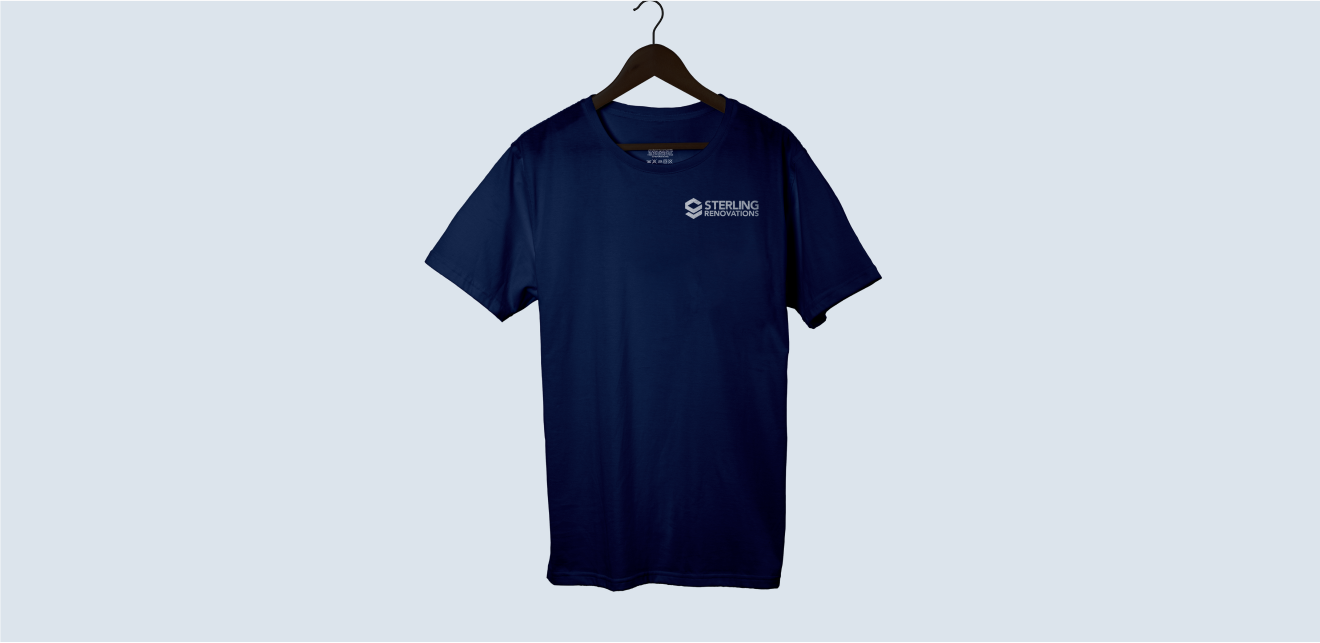
Team Alignment
Consistent branding across uniforms and materials fosters a sense of pride and professionalism among the team.
Built to Grow
The flexible brand system is designed to grow with the business, supporting new services, campaigns, and marketing opportunities easily.
From concept
to compliments
Lucy Lewis
Creative
collaborations
Conversis
An updated brand that reflects Conversis’ commitment to providing high-quality translation services.
Authentic Brew
A bold, characterful brand that embodies the essence of authenticity and a passion for exceptional flavour.
Longmuir Financial Planning
Start-up branding reflecting Longmuir Financial Planning’s commitment to providing tailored financial advice.
Sneaker Sisterhood
An energetic and vibrant brand refresh designed to celebrate inclusivity, empowerment, and sneakers.
Sterling Renovations
A brand identity that captures Sterling Renovations’ passion for quality craftsmanship.
Hansard Owens
A sophisticated brand that embodies trust and expertise in financial planning and wealth management.
Kyte Financial Planning
A sleek, modern brand designed to reflect clarity, confidence, and a sense of financial freedom.
New Leaf Academy
A fresh, modern, and positive brand inspiring growth and learning with a nature-inspired identity.