
Conversis

Logo Design         Branding         Digital Design
  • Logo Design
  • Branding
  • Print
  • Digital Design
  • Social Media
Logo header

Translating a
brand vision

We worked with Conversis to revitalise their brand identity ahead of their relaunch, creating a modern and confident design system that aligns with their ambition to lead the way in global translation and localisation services. The refreshed brand centres on clarity, professionalism, and consistency, bringing fresh energy to every brand touchpoint, from logo and colour palette to business collateral.
Branding logo GIF

The Brief

To redefine Conversis' visual identity to better reflect their expertise, innovation, and trusted presence in the translation space. Conversis sought to elevate their brand to align with their reputation for providing exceptional translation services. They want to convey their authority in the industry while showcasing their commitment to innovation and high-quality solutions.
  • Refresh the logo and brand identity to feel modern, established and global
  • Develop a versatile colour palette and font system for use across all media
  • Create cohesive email and digital communication templates
  • Enhance brand recognition and usability in internal and external comms

The Process

We began by exploring Conversis' position in the market and the goals of their relaunch. After collaborative workshops and creative exploration, we aligned on a bold yet approachable aesthetic that would signal confidence and professionalism. Once the core brand assets were agreed, we applied the refreshed identity across all essential materials, ensuring everything from presentations to email signatures felt unified, purposeful, and on-brand.
  • Analysed Conversis' current market standing and identified key goals for their relaunch to ensure a targeted approach
  • Held in-depth sessions with the Conversis team to understand their values, vision, and aspirations for the brand's future
  • Explored a variety of visual directions, combining boldness with approachability to create a distinctive aesthetic
Graphic Icon
The 3 dots in the middle represent text / speech
Graphic Icon
The connect dots represent the life-sciences i.e atoms
Graphic Icon
The dots form a C within the negative space

The Solution

Our solution was a cohesive and sophisticated brand identity that balances heritage with forward momentum. We crafted a design that honoured Conversis' longstanding reputation for quality and trust while also embracing a modern, innovative direction.

The refreshed visual identity seamlessly integrates elements that reflect the brand's established expertise in the translation industry, while introducing bold, contemporary touches that signal growth and adaptability.The result was a brand that exudes professionalism and reliability, yet speaks to the future with a clear vision for innovation and global reach.

  • Logo Redesign: A modern, confident word mark supported by a clean icon: clear, scalable, and impactful
  • Refined Colour Palette: A fresh blend of Navy, Cyan, Grey, and Ivory, offer a professional and contemporary tone
  • Email Templates & Signatures: Built for clarity and consistent communication with clients and partners
  • Print-Ready Assets: Letterheads, PDF templates, and pricing sheets created to support sales and marketing efforts

The pixel-
powered impact

Clearer Brand Recognition

A bold new logo and refined colour system helps Conversis stand out while remaining professional and trustworthy.

Unified Visual Language

Every brand touchpoint is aligned, from internal documents to client communications.

Improved Communication

Branded templates and assets make it easier for the team to communicate with consistency and confidence.

Stronger Brand Positioning

The refreshed identity supports their place in the industry as a forward-thinking, globally focused provider.

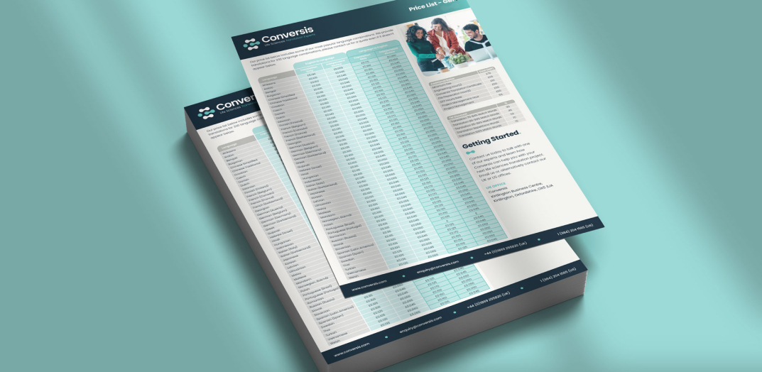
Time-Saving Templates

Ready-to-use tools like PowerPoint decks and PDFs speed up internal workflows.

Ready for Relaunch

Conversis now has a robust, future-proof brand system that sets the stage for renewed growth and visibility.

From concept
to compliments

Client headshot

Valerie Carlson

Conversis Marketing and Business Development Director
Working with Little Pixel creative was so refreshing. Our ethos and mission was understood immediately, and working together was collaborative and got us exactly the brand refresh we needed. It encapsulated all of our key messaging and brought our brand to the next level.
grey-stars

Creative
collaborations

Conversis

An updated brand that reflects Conversis’ commitment to providing high-quality translation services.

Authentic Brew

A bold, characterful brand that embodies the essence of authenticity and a passion for exceptional flavour.

Longmuir Financial Planning

Start-up branding reflecting Longmuir Financial Planning’s commitment to providing tailored financial advice.

Sneaker Sisterhood

An energetic and vibrant brand refresh designed to celebrate inclusivity, empowerment, and sneakers.

Sterling Renovations

A brand identity that captures Sterling Renovations’ passion for quality craftsmanship.

Hansard Owens

A sophisticated brand that embodies trust and expertise in financial planning and wealth management.

Kyte Financial Planning

A sleek, modern brand designed to reflect clarity, confidence, and a sense of financial freedom.

New Leaf Academy

A fresh, modern, and positive brand inspiring growth and learning with a nature-inspired identity.