Mayflower Financial Solutions
- Logo Design
- Branding
- Print
- Digital Design
Navigating
Financial Clarity
We partnered with Mayflower Financial Solutions from the very beginning, helping to name the business and shape a distinctive brand identity rooted in connection, direction, and purpose. Inspired by the journey of the Mayflower ship and the idea of guiding clients through the financial landscape, we crafted a visual system and supporting assets that reflect clarity, trust, and forward momentum.

The Brief
Mayflower Financial Solutions approached us at the very beginning of their journey. They wanted to build a financial advice business rooted in trust, clarity and long-term guidance, but needed a strong identity to bring that vision to life. Drawing inspiration from the Mayflower ship and a deep personal connection to Portsmouth, the aim was to create a brand that symbolised navigation, direction and steady progress through the financial landscape.
- Create a memorable and meaningful brand name
- Develop a logo and overall brand identity that embodies clarity and guidance
- Ensure the brand works across both digital and print touchpoints
- Reflect Mayflower's core values of trust, clarity, and direction in every visual
The Solution
Our solution was to build a brand identity that feels calm, confident and direction-led, rooted in heritage, but designed for modern financial advice.
Starting with the name, Mayflower Financial Solutions became the anchor for the entire identity. Inspired by the historic Mayflower ship and the symbolism of navigation and new horizons, we created a brand that subtly communicates guidance, journey and forward movement without leaning into cliché nautical imagery. The visual identity centres around flowing wave forms and directional cues, representing both the ever-changing financial landscape and Mayflower's role in helping clients steer through it with clarity and confidence.
- Logo & Branding: A thoughtful mark inspired by movement, direction and the hull of a boat, suggesting steady guidance through financial choices
- Colour Palette & Typography: A confident, calm palette paired with clean typography to convey professionalism and clarity
- Supporting Assets: Print-ready business cards, letterheads, email signatures and document templates designed for consistency
- Flexible Design System: A visual language that adapts to digital platforms, email communications and client touchpoints
- Brand Direction: Guidance on how to extend the identity across future materials and applications
The pixel-
powered impact
A Standout Brand Identity
The brand reflects Mayflower's values of guidance, clarity and reliability at a glance.
Meaningful Storytelling
A name and visual system rooted in purpose and regional heritage.
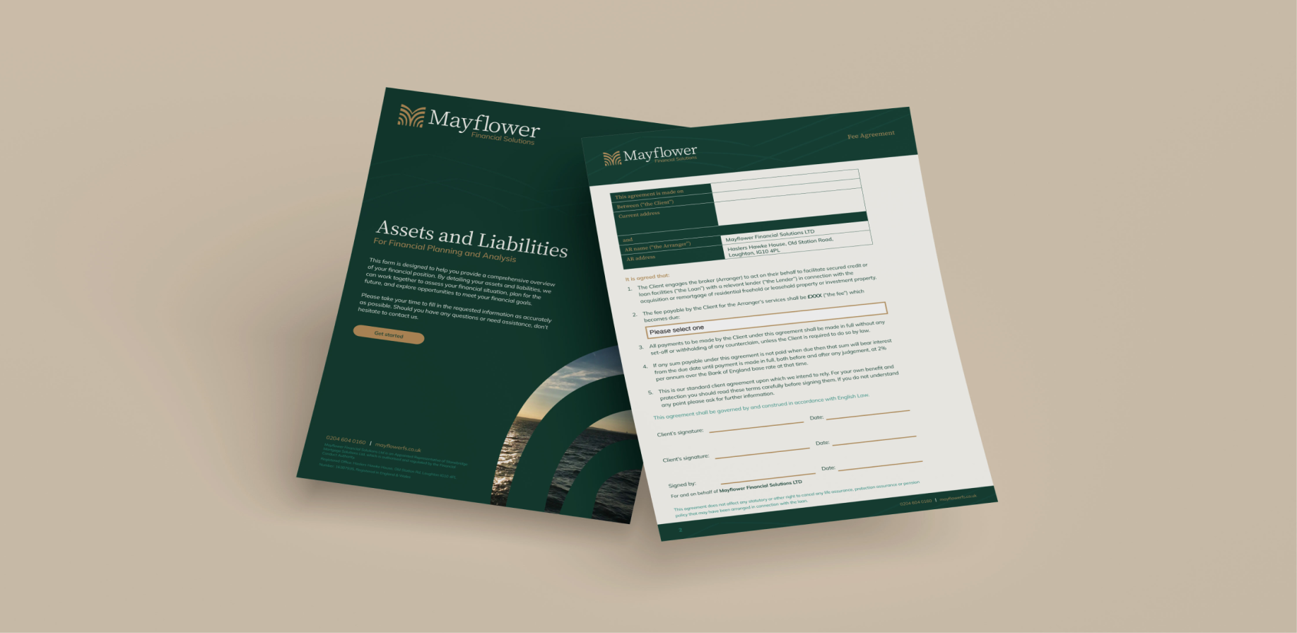
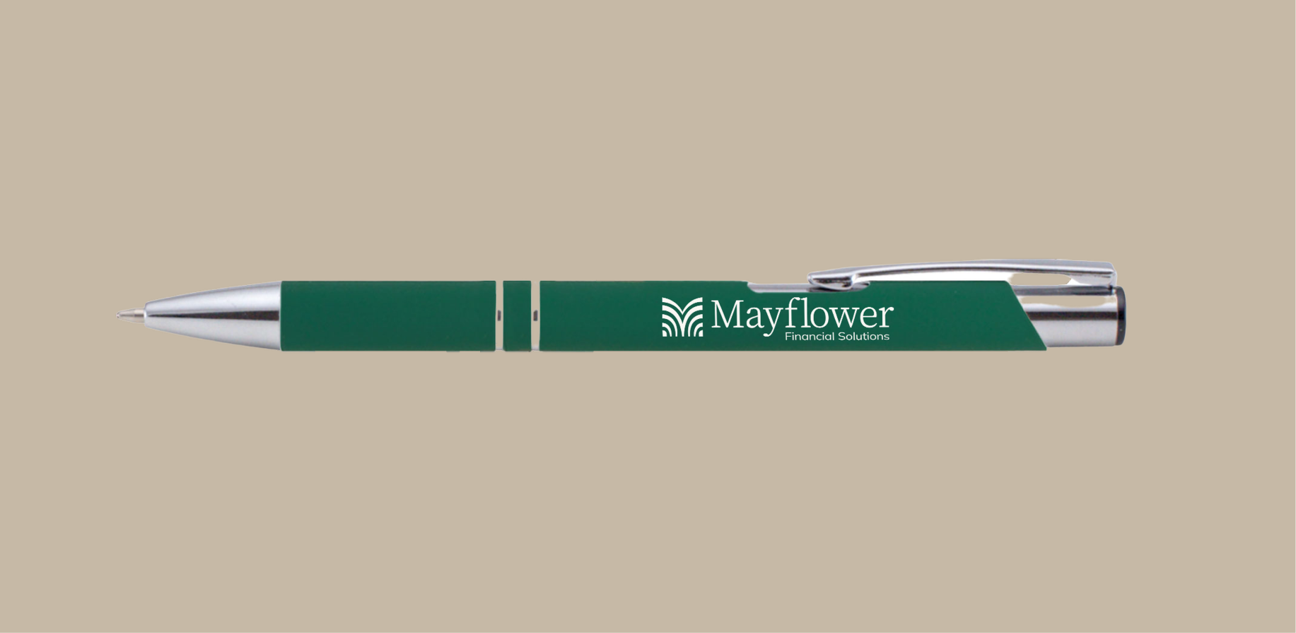
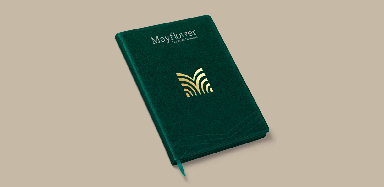
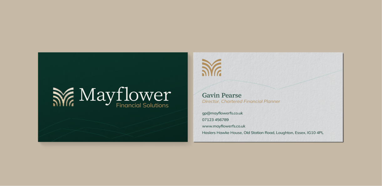
Consistant Brand Presence
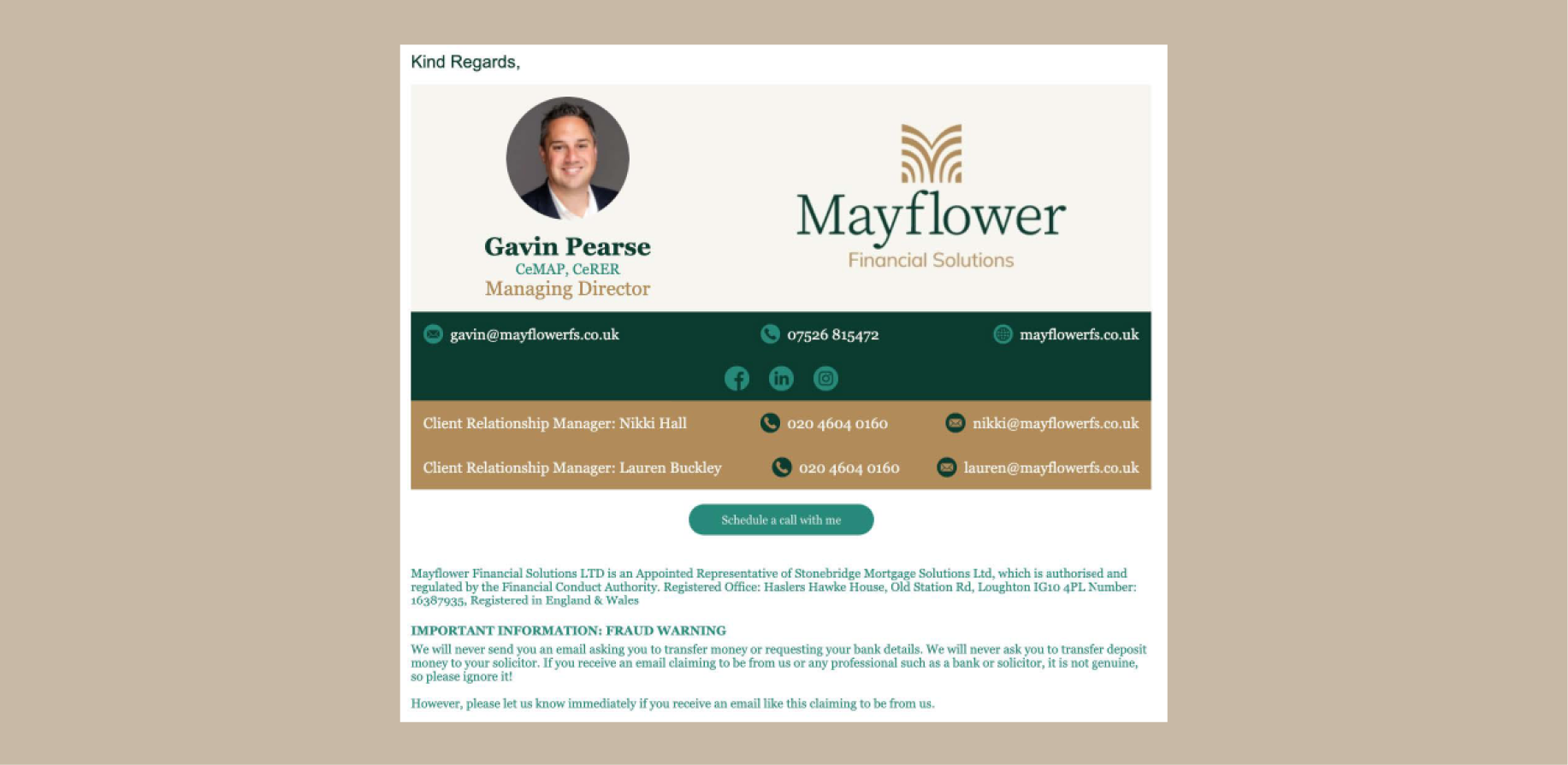
Printed and digital collateral and templates that feel unified and professional.
Scalable Design
A brand system built to grow and adapt with the business.
Clear Communication
A visual language that supports confident client interactions across touchpoint.
Trust-Building Visuals
A professional identity that helps reinforce credibility in a competitive market.
From concept
to compliments
Gavin Pearse
Creative
collaborations
Conversis
An updated brand that reflects Conversis’ commitment to providing high-quality translation services.
Authentic Brew
A bold, characterful brand that embodies the essence of authenticity and a passion for exceptional flavour.
Longmuir Financial Planning
Start-up branding reflecting Longmuir Financial Planning’s commitment to providing tailored financial advice.
Sneaker Sisterhood
An energetic and vibrant brand refresh designed to celebrate inclusivity, empowerment, and sneakers.
Sterling Renovations
A brand identity that captures Sterling Renovations’ passion for quality craftsmanship.
Hansard Owens
A sophisticated brand that embodies trust and expertise in financial planning and wealth management.
Kyte Financial Planning
A sleek, modern brand designed to reflect clarity, confidence, and a sense of financial freedom.